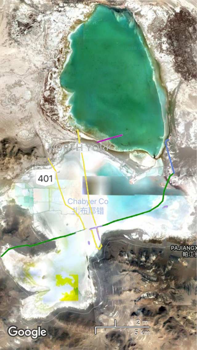
My interest in maps, borders and how these things change has been on my mind a lot lately. I’ve always loved looking at Google Earth and the maps satellite view. There’s this neutral visual data, a portrayal of the earth, mixed with man-made and established lines and dashes and dots that annotate cities and streets and borders.
The visual data is often skewed and pixelated, colors turning into rich shades untrue to the reality of the landscape. Big cities are now layered with colorful lines showing the mass-transit systems of the location. These oft-assumed “neutral” maps are not necessarily neutral and are images that have been processed through software and receive the overlay of manmade ideas of land ownership.
I created these images and they are a combination of the satellite images and designed transit systems Google Maps presents to their users. They play with the idea of borders and who holds claim to what land, and how inherently absurd the idea is. They also orient you to a newly defined place – land that is not distinguishable based on the satellite image alone and cities that are familiar to us but out of their original context.


